Kriptofolio app series – Part 2: Mockups, UI, XML layouts
So how actually start to build new app? What should be your first move? If you think we just need to launch Android Studio and jump directly to the code, you are completely wrong. That’s exactly the first thing I would advice not to do as it can make more damage than good. Even it is so tempting to start writing your first lines of code as soon as possible, instead I would suggest to focus on making a wise plan — UI mockups. Remember every good new app project should start with that. Only with such approach you will not loose a lot of time and be able to build high quality product from the beginning. So in this part I will present “Kriptofolio” (previously “My Crypto Coins”) app mockups, discuss how to create them. Also we are going to build all the UI layouts more or less as it will become our solid foundation indicating us clearly for what to code. Finally we will localize our app to different languages and learn how to handle the ones which are written from right to left.
Series content
- Introduction: Roadmap to build modern Android app in 2018-2019
- Part 1: SOLID principles
- Part 2: Mockups, UI, XML layouts (you’re here)
- Part 3: Architecture patterns MVC, MVP, MVVM with Android Architecture Components – ViewModel, LiveData, Data Binding, Room
- Part 4: Dependency Injection with Dagger 2
- Part 5: Handle RESTful Web Services using Retrofit, OkHttp, Gson, Glide and Coroutines
Mockups
There are various different ways you can go to create your project mockups. Perhaps the most simple one is just to take a pencil and a sheet of paper and start drawing on it. The best part that this way basically don’t cost you anything and you can start immediately. Oh and I almost forgot, you should also get yourself an eraser as there will not be any undo function. 🙂 If you like me feel that you need more functionality, more tools to have in your hands, than consider using special software for creating detailed mockups. I prefer using software instead of pencil & paper even it requires you to invest your money to buy it and your time to learn how to use it. There are various software on the market to choose from and you will have to do your own investigation which one fits best all your needs. For all my projects mockups right now I am using Balsamiq Mockups for Desktop app — rapid, effective and very easy to use wireframing software. As I am rather happy with it, I could confidently recommend it for creating Android apps, so please feel free to try.

I started My Crypto Coins app project by creating really well thought out and very detailed mockups. I thought to myself if I will create everything in a very detailed way than I will avoid mistakes and don’t waste additional time for suddenly changing functionality during development process. Personally I think if you put a lot of effort on creating good mockups than with a little bit of imagination you can see and feel final product which your users will get. My goal was to have everything defined in the mockups like it should look in the end product and for that I tried not to rush but spend as much time as I needed. Here is my final mockups for My Crypto Coins app:

Stock design – Material
Another important thing to talk about is app visual design. At the time of writing Material Design is stock visual design recommended by Google for all Android apps. And guess what, you can’t go wrong with stock design. If you don’t agree with me just think a moment about life situation when you would need to buy a house for example. Would you be interested more to choose one decorated with some crazy colors and decoration solutions or rather go with the traditional neutral one. OK perhaps you are artistic character type of person, but most of people appreciates more ordinary look acceptable for all general public. So stock design will be perfect choice if you build your new app for masses and not just for exclusive audience. For My Crypto Coins app we will be definitely using Material Design based on the best practices for it defined in detailed online guidelines as our target audience expects confident secure financial product which can be best implemented by traditional solutions.

Material.io/guidelines – official material design living specs document which will be our design guidelines for this project.
Layouts
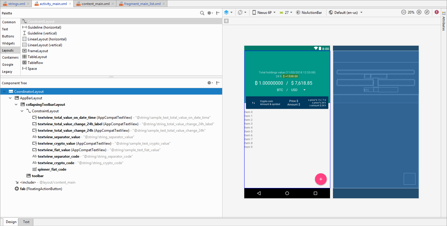
Now when we already have wireframes of our app prepared, it’s time to build real UI. Again we could be jumping directly to write a code, but why to rush. Instead I would recommend concentrating on building all your XML layouts. My advice here would be that the more you manage to put to XML the less code you will need to write. Android team is constantly improving the way you can build your UI by adding new features to XML layouts. Even sometimes it’s so tempting to write few lines of code to reach desired look, it’s much more better to investigate topic more deeply to find if similar thing is possible to do without a code. Remember less code and your project will look cleaner, better understandable for other developers and easier maintainable. Finally when you will create all your XML layouts you will feel like you have all your app made as you will be able to launch it and see how it feels for the end user. It doesn’t matter that it is showing some fake data and does nothing, but now you have the last chance to make some drastic changes. If you are building an app for somebody else, it’s such a good time to present it. Maybe you will be asked to make some surprising last minute changes and that way you will avoid writing a code for the functionality which would be never used. A lot of people just don’t have enough imagination and they need to see and touch first to decide if it is what they want. So don’t leave your layouts for the last place in your work process.
For this app I will be using various components that are so common in all modern Android apps:
- CoordinatorLayout — a super-powered FrameLayout, which main appeal is its ability to coordinate the animations and transitions of the views within it.
- AppBarLayout — a vertical LinearLayout which implements many of the features of material designs app bar concept, namely scrolling gestures.
- Toolbar — a generalization of action bars for use within application layouts.
- CollapsingToolbarLayout — a wrapper for Toolbar which implements a collapsing app bar. It is designed to be used as a direct child of a AppBarLayout.
- ConstraintLayout — a ViewGroup which allows you to position and size widgets in a flexible way. Imagine a RelativeLayout on steroids.
- SwipeRefreshLayout — the widget which allows the swipe-to-refresh user interface pattern to be implemented entirely. It detects the vertical swipe, displays a distinctive progress bar, and triggers callback methods in your app.
- FloatingActionButton — a circular button that triggers the primary action in your app’s UI.
For the main screen we will use the combination of all these components to create nice UI/UX, where user can expand and collapse top part of the layout to find total value of all cryptocurrencies portfolio, to check value change during last 24 hours and to change selected fiat currency fast.
Of course besides these mine mentioned components exists other important ones too which at this moment I have not used in My Crypto Coins app or just not listed here. But actually I think it is very important to master all the component palette to have natural insight about which one to use in particular case. With the mobile trends changing from time to time the palette will expand too. I am not going to talk about every component individually, but advice to investigate that on your own. For me the best way to understand them is by trying to build XML layouts writing manually instead of using automatic drag & drop tools in Android Studio.
Styles, Colors, Dimensions, Strings, Icons
On the first thought things mentioned in this subtitle sounds like not the important ones. However I ask you to put effort when creating them in any app if you want to make it modern and exclusive. Remember this blog posts series of how to build MODERN Android app! No matter how wrong it is, people will usually judge your app by its looks first, not the functionality. So here it’s a perfect chance to earn new users love from the beginning. Here are my tips:
- When building your XML layout files you should recognize where you repeat some common attributes for the views and move them to be defined as separate styles XML. That way you will have shorter XML layout files and can control all the app styling aspects from separate place. Just imagine what benefits it would give. For example this could allow you to create ability for the user to choose app skin (bright, dark, etc.).
- Define all your app colors in separate file too and enjoy ability to experiment with the look by changing them immediately. Sometimes same product can reborn to new life and engage users by just simply refreshing with new colors. To help with nice colors choice there are quite a few websites created, but my favorite one is MaterialPalette.com, so take a look.
- Define your app dimensions in the separate file and this will allow you very easy to adjust your app to look good on different size screens.
- All your strings should not be hard-coded, and you will be informed by Android Studio if you forget. Do not ignore that. The best part when your strings are separated, that you can easily translate your app to different languages.
- When using icons for your app, always prefer XML vector drawable format. That’s the new recommended standard and a clever way to go to avoid any pixelation. To find many professionally made material design style icons from the community, please check a website MaterialDesignIcons.com which I also used to get icons for My Crypto Coins app.
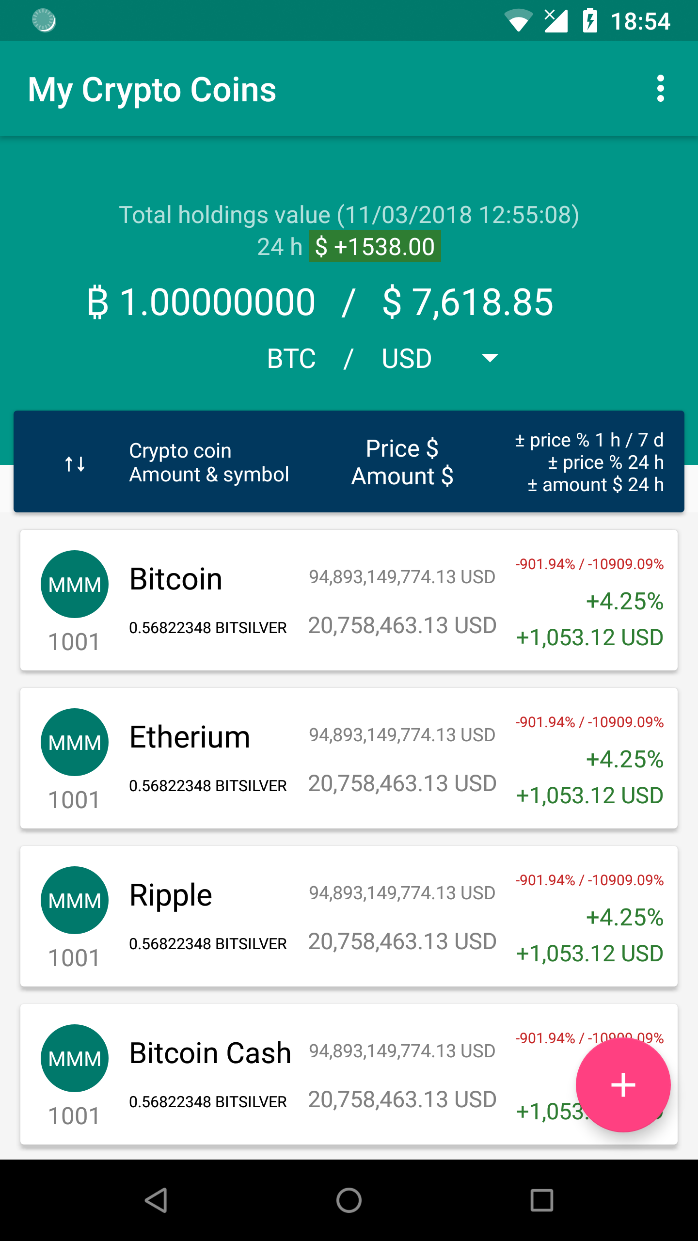
RecyclerView
The main screen of My Crypto Coins app should consist of a list of cryptocurrencies that user personally holds. For this purpose best fits RecyclerView — a widget to display a scrolling list of elements based on large data sets (or data that frequently changes). Basically because of its advantages, RecyclerView nowadays became main recommended component for creating any list screen. It is a more advanced and flexible version of simpler ListView component about which we will talk later too. In this part we are creating just layouts and not concentrating on coding, but in order to see our app visual part fully build and running we will have to implement RecyclerView by writing some code. These are the steps to implement RecyclerView:
1. Add a RecyclerView component.
Our MainActivity layout is activity_main.xml. This layout includes content_main.xml layout which is fragment. This MainActivityListFragment layout inflates fragment_main_list.xml. So you should add RecyclerView component here.
...
<android.support.v7.widget.RecyclerView
    android:id="@+id/recyclerview_fragment_main_list"
    android:layout_width="match_parent"
    android:layout_height="wrap_content"
    android:background="@color/colorForMainListBackground"
    android:clipToPadding="false"
    android:paddingBottom="72dp"
    android:paddingTop="5dp"
    android:scrollbarStyle="outsideOverlay"
    android:scrollbars="vertical" />
...
As you see we configure our RecyclerView to leave some padding space at the bottom to avoid covering last list item by FloatingActionButton. Also we turn on vertical scrollbar to be available.
2. Create RecyclerView row layout.
For initial purpose we will only set item name for each row and our layout simplified should look something similar like that.
<android.support.v7.widget.CardView xmlns:android="http://schemas.android.com/apk/res/android"
    xmlns:app="http://schemas.android.com/apk/res-auto"
    xmlns:tools="http://schemas.android.com/tools"
    android:layout_width="match_parent"
    android:layout_height="wrap_content"
    android:layout_marginBottom="@dimen/main_cardview_list_item_outer_top_bottom_margin"
    android:layout_marginEnd="@dimen/main_cardview_list_item_outer_start_end_margin"
    android:layout_marginStart="@dimen/main_cardview_list_item_outer_start_end_margin"
    android:layout_marginTop="@dimen/main_cardview_list_item_outer_top_bottom_margin"
    android:foreground="?android:attr/selectableItemBackground"
    android:clickable="true"
    android:focusable="true"
    app:cardBackgroundColor="@color/colorForMainListItemBackground">

    <android.support.constraint.ConstraintLayout
        android:layout_width="match_parent"
        android:layout_height="wrap_content"
        android:padding="@dimen/main_cardview_list_item_inner_margin">
        ...
        <android.support.v7.widget.AppCompatTextView
            android:id="@+id/item_name"
            style="@style/MainListItemPrimeText"
            android:layout_marginEnd="@dimen/main_cardview_list_item_text_between_margin"
            android:layout_marginStart="@dimen/main_cardview_list_item_inner_margin"
            app:layout_constraintBottom_toTopOf="@+id/item_amount_symbol"
            app:layout_constraintEnd_toStartOf="@+id/guideline1_percent"
            app:layout_constraintStart_toEndOf="@+id/item_image_icon"
            app:layout_constraintTop_toTopOf="parent"
            app:layout_constraintVertical_chainStyle="spread"
            tools:text="@string/sample_text_item_name" />
        ...
    </android.support.constraint.ConstraintLayout>

</android.support.v7.widget.CardView>
3. Create data adapter class.
Our adapter just for now will accept string data, but later we will need to create separate class data model as we will need to pass more information than only one string.
class MainRecyclerViewAdapter(val dataList: ArrayList<String>) : RecyclerView.Adapter<MainRecyclerViewAdapter.CustomViewHolder>() {

    override fun onCreateViewHolder(parent: ViewGroup, viewType: Int): CustomViewHolder {
        val v = LayoutInflater.from(parent.context).inflate(R.layout.fragment_main_list_item, parent, false)
        return CustomViewHolder(v)
    }

    override fun onBindViewHolder(holder: CustomViewHolder, position: Int) {
        holder.txtName?.text = dataList[position]
    }

    override fun getItemCount(): Int {
        return dataList.size
    }


    inner class CustomViewHolder(itemView: View) : RecyclerView.ViewHolder(itemView) {

        val txtName = itemView.findViewById<TextView>(R.id.item_name)
    }
}
4. Connect RecyclerView to custom adapter.
class MainActivityListFragment : Fragment() {

    private lateinit var recyclerView: RecyclerView
    private lateinit var recyclerAdapter: MainRecyclerViewAdapter

    override fun onCreateView(inflater: LayoutInflater, container: ViewGroup?,
                              savedInstanceState: Bundle?): View? {
        val v: View = inflater.inflate(R.layout.fragment_main_list, container, false)

        recyclerView = v.findViewById(R.id.recyclerview_fragment_main_list)

        return v
    }

    override fun onActivityCreated(savedInstanceState: Bundle?) {

        super.onActivityCreated(savedInstanceState)

        setupList()
    }

    private fun setupList() {

        val data = ArrayList<String>()
        data.add("Bitcoin")
        data.add("Etherium")
        data.add("Ripple")
        data.add("Bitcoin Cash")
        data.add("Litecoin")
        data.add("NEO")
        data.add("Stellar")
        data.add("EOS")
        data.add("Cardano")
        data.add("Stellar")
        data.add("IOTA")
        data.add("Dash")
        data.add("Monero")
        data.add("TRON")
        data.add("NEM")
        data.add("ICON")
        data.add("Bitcoin Gold")
        data.add("Zcash")
        data.add("Verge")

        recyclerView.layoutManager = LinearLayoutManager(activity)
        recyclerAdapter = MainRecyclerViewAdapter(data)
        recyclerView.adapter = recyclerAdapter
    }
}
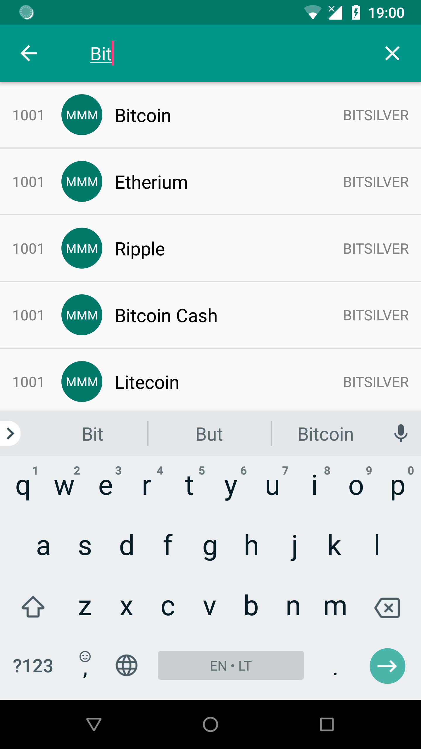
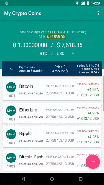
Done! Now our main screen looks like this:
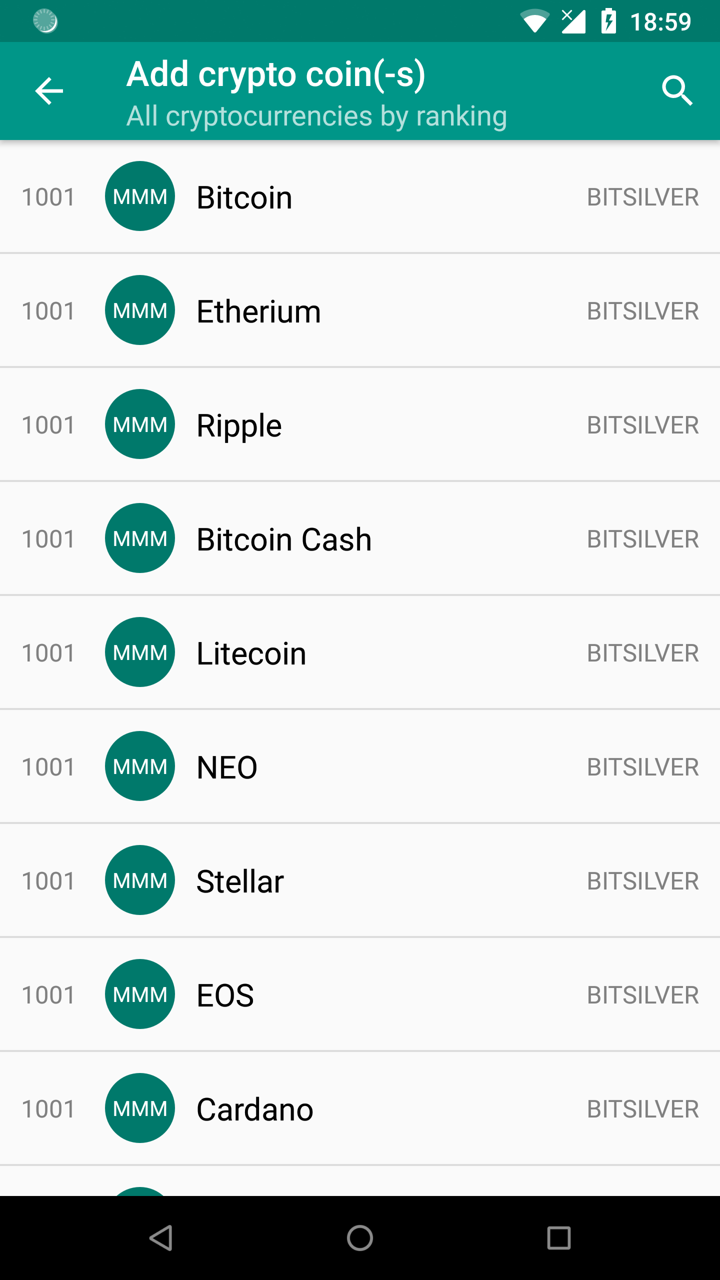
ListView
In this project ListView will be used for the screen where you can add crypto coin(-s) which you already hold. ListView is predecessor of RecyclerView and because of its shortcomings in recent years it became hardly used anymore. So I guess a lot of you at this moment are wondering why I decided to use it in My Crypto Coins app. There is no particular reason why it should be used as we could create same functionality easily with RecyclerView. However remember this project is created for training purpose first and I thought it would be beneficial to gain insights into ListView and how it works. Any developer may run into ListView in legacy code, and it’s best to know how to work with it. Besides all that the list which we will be creating is so simple that ListView technical limitations won’t cause us any problems. Let’s follow very similar steps needed to implement ListView:
1. Add a ListView component.
The first thing to do is to add a ListView to AddSearchActivity. Open activity layout file activity_add_search.xml and you will see that it includes content_add_search.xml. There we will add ListView component.
...
<ListView
    android:id="@+id/listview_activity_add_search"
    android:layout_width="match_parent"
    android:layout_height="wrap_content"
    android:scrollbars="vertical" />
...
2. Create ListView row layout.
As before just for initial purpose we will only set item name for each row. Here provided row layout is simplified.
<android.support.constraint.ConstraintLayout xmlns:android="http://schemas.android.com/apk/res/android"
    xmlns:app="http://schemas.android.com/apk/res-auto"
    xmlns:tools="http://schemas.android.com/tools"
    android:layout_width="match_parent"
    android:layout_height="match_parent"
    android:padding="@dimen/add_search_list_item_inner_margin">
    ...
    <android.support.v7.widget.AppCompatTextView
        android:id="@+id/item_name"
        style="@style/AddSearchListItemPrimeText"
        android:layout_marginEnd="@dimen/add_search_list_item_text_between_margin_2x"
        android:layout_marginStart="@dimen/add_search_list_item_text_between_margin"
        app:layout_constraintBottom_toBottomOf="parent"
        app:layout_constraintEnd_toStartOf="@+id/item_symbol"
        app:layout_constraintStart_toEndOf="@+id/item_image_icon"
        app:layout_constraintTop_toTopOf="parent"
        tools:text="@string/sample_text_item_name" />
    ...
</android.support.constraint.ConstraintLayout>
3. Create data adapter class.
Similar to RecyclerView our ListView adapter just for now will accept only string data to get item name and show visually on screen for us. Later we will use separate class data model. As for this part we want to build a very simple list displaying only cryptocurrencies titles, instead of creating our custom adapter we could use default one ArrayAdapter.
class AddSearchListAdapter(context: Context, private val dataSource: ArrayList<String>) : BaseAdapter() {

    private val inflater: LayoutInflater = context.getSystemService(Context.LAYOUT_INFLATER_SERVICE) as LayoutInflater

    override fun getView(position: Int, convertView: View?, parent: ViewGroup?): View {
        val view: View
        val holder: CustomViewHolder

        if (convertView == null) {

            view = inflater.inflate(R.layout.activity_add_search_list_item, parent, false)

            holder = CustomViewHolder()
            holder.nameTextView = view.findViewById(R.id.item_name)

            view.tag = holder

        } else {

            view = convertView
            holder = convertView.tag as CustomViewHolder
        }

        val nameTextView = holder.nameTextView

        nameTextView.text = getItem(position) as String

        return view
    }

    override fun getItem(position: Int): Any {
        return dataSource[position]
    }

    override fun getItemId(position: Int): Long {
        return position.toLong();
    }

    override fun getCount(): Int {
        return dataSource.size
    }


    inner class CustomViewHolder {
        lateinit var nameTextView: AppCompatTextView
    }

}
As you see in the adapter code by creating CustomViewHolder object I use ViewHolder pattern. It stores list row views references and, thanks to this, calling the findViewById() method only occurs a couple of times, rather than for the entire dataset and on each bind view. It allows us to make our list scrolling act smoothly and efficiently. The ListView doesn’t require us to use ViewHolder pattern, while the RecyclerView’s adapter give us that kind of protection by default as it forces us to use it.
4. Connect ListView to custom adapter.
With default ArrayAdapter it could look like that val adapter = ArrayAdapter(this, android.R.layout.simple_list_item_1, data). That’s the beauty of ListView component, because if you want, you can create a simple list really fast without building your own adapter or row layout (skip steps 3 and 2).
class AddSearchActivity : AppCompatActivity() {

    private lateinit var listView: ListView

    override fun onCreate(savedInstanceState: Bundle?) {
        super.onCreate(savedInstanceState)
        setContentView(R.layout.activity_add_search)
        setSupportActionBar(toolbar2)
        supportActionBar?.setDisplayHomeAsUpEnabled(true)

        val data = ArrayList<String>()
        data.add("Bitcoin")
        data.add("Etherium")
        data.add("Ripple")
        data.add("Bitcoin Cash")
        data.add("Litecoin")
        data.add("NEO")
        data.add("Stellar")
        data.add("EOS")
        data.add("Cardano")
        data.add("Stellar")
        data.add("IOTA")
        data.add("Dash")
        data.add("Monero")
        data.add("TRON")
        data.add("NEM")
        data.add("ICON")
        data.add("Bitcoin Gold")
        data.add("Zcash")
        data.add("Verge")

        val adapter = AddSearchListAdapter(this, data)

        listView = findViewById(R.id.listview_activity_add_search)
        listView.adapter = adapter

    }
    ...
}
ListView setup is ready!
SearchView
In the same screen with all cryptocurrencies listed in the simple ListView we also need to add SearchView. Search will be useful functionality to have for any user who wants to find specific cryptocurrency by just typing its name. For this part we will not build functionality fully but just implement its visual part. Follow these steps to add SearchView to the project:
1. Declare the searchable configuration in XML.
The searchable configuration file should be added in your res directory named xml. Here you can specify attributes for your SearchView component which defines how it behaves.
<searchable
    xmlns:android="http://schemas.android.com/apk/res/android"
    android:label="@string/app_name"
    android:hint="@string/search_hint">
</searchable>
2. Create new activity which will become our searchable activity.
We are going to create new blank activity which extends AppCompatActivity() and name it AddSearchActivity.
3. Specify newly created activity in Android manifest file to be searchable.
<manifest xmlns:android="http://schemas.android.com/apk/res/android"
    package="com.baruckis.mycryptocoins">

    <application
        android:allowBackup="true"
        android:icon="@mipmap/ic_launcher"
        android:label="@string/app_name"
        android:roundIcon="@mipmap/ic_launcher_round"
        android:supportsRtl="true"
        android:theme="@style/AppTheme">
        ...
        <activity
            android:name=".AddSearchList.AddSearchActivity"
            android:launchMode="singleTop"
            android:parentActivityName=".MainList.MainActivity"
            android:theme="@style/AppTheme.NoActionBar">
            <intent-filter>
                <action android:name="android.intent.action.SEARCH" />
            </intent-filter>
            <meta-data
                android:name="android.app.searchable"
                android:resource="@xml/searchable" />
        </activity>
        ...
    </application>

</manifest>
We will let the Android system handle the search process, that’s why we add the intent action search and meta-data in the activity element of the AddSearchActivity. The meta-data has name and resource which is linked to searchable configuration file located in res/xml folder.
4. Create search menu.
Inside the res/menu folder we are going to create a menu resource file.
<menu xmlns:android="http://schemas.android.com/apk/res/android"
    xmlns:app="http://schemas.android.com/apk/res-auto">
    <item
        android:id="@+id/search"
        android:icon="@drawable/ic_search"
        android:title="@string/action_search"
        app:actionViewClass="android.support.v7.widget.SearchView"
        app:showAsAction="ifRoom|collapseActionView" />
</menu>
5. Add search menu to activity.
We will add the Android search widget as a menu action view.
class AddSearchActivity : AppCompatActivity() {
    ...
    override fun onCreateOptionsMenu(menu: Menu?): Boolean {

        menuInflater.inflate(R.menu.menu_search, menu)

        val searchManager = getSystemService(Context.SEARCH_SERVICE) as SearchManager
        val searchView = menu?.findItem(R.id.search)?.actionView as SearchView
        searchView.setSearchableInfo(searchManager.getSearchableInfo(componentName))
        searchView.maxWidth = Integer.MAX_VALUE

        return true
    }
}
Now the SearchView is added to the activity. Still searching functionality is not working, but we have it visually implemented as we wanted for this part.
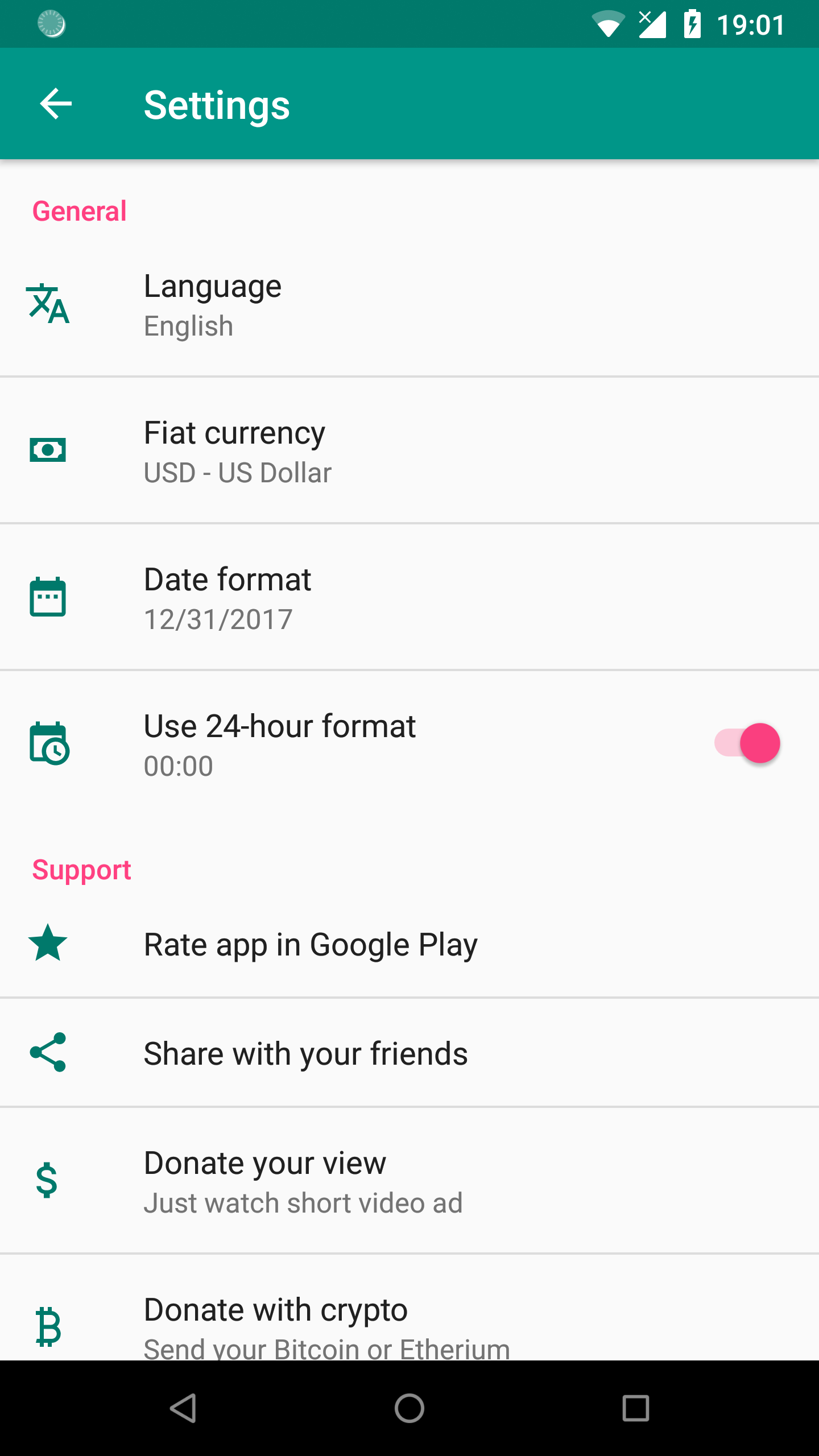
Settings
In my opinion if you want to create modern Android app it’s highly recommended to include settings screen and give access to app settings for the user. Including settings in your app gives your users the power to control some of the functionality of your app which makes them more happy instead of angry, because they are now in control of how the app behaves. So we are going to create settings screen for My Crypto Coins app too.
You can create settings screen very easy with Android Studio template and it will generate all the code you need. By default at the time of writing this blog post, settings activity is generated with preference headers. That’s not what we want for such a small app where we plan to have only few settings at first.
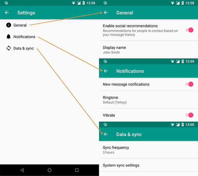
Therefore we are going to build everything manually. Settings screen is designed with an XML just like layout. Let’s go step by step to create again only visual part for this blog post:
1. Create preferences screen XML file.
We are going to create preferences screen XML file which should be placed in res/xml directory.
<PreferenceScreen xmlns:android="http://schemas.android.com/apk/res/android"
    xmlns:tools="http://schemas.android.com/tools">
    <PreferenceCategory android:title="@string/pref_general_category_title">
        <ListPreference
            android:defaultValue="@string/pref_default_language_value"
            android:entries="@array/pref_language_list_entries"
            android:entryValues="@array/pref_language_list_values"
            android:icon="@drawable/ic_translate"
            android:key="language_list"
            android:summary="@string/pref_default_language_entry"
            android:title="@string/pref_language_title"
            tools:summary="@string/pref_default_language_entry" />

        <ListPreference
            android:defaultValue="@string/pref_default_fiat_currency_value"
            android:entries="@array/pref_fiat_currency_list_entries"
            android:entryValues="@array/pref_fiat_currency_list_values"
            android:icon="@drawable/ic_cash"
            android:key="fiat_currency_list"
            android:summary="@string/pref_default_fiat_currency_entry"
            android:title="@string/pref_fiat_currency_title"
            tools:summary="@string/pref_default_fiat_currency_entry" />

        <ListPreference
            android:defaultValue="@string/pref_default_date_format_value"
            android:entries="@array/pref_date_format_list_entries"
            android:entryValues="@array/pref_date_format_list_values"
            android:icon="@drawable/ic_date_range"
            android:key="date_format_list"
            android:summary="@string/pref_default_date_format_entry"
            android:title="@string/pref_date_format_title"
            tools:summary="@string/pref_default_date_format_entry" />

        <SwitchPreference
            android:defaultValue="true"
            android:icon="@drawable/ic_calendar_clock"
            android:key="24h_switch"
            android:summary="@string/pref_24h_switch_summary"
            android:title="@string/pref_24h_switch_title" />

    </PreferenceCategory>

    <PreferenceCategory android:title="@string/pref_support_category_title">

        <Preference
            android:icon="@drawable/ic_star"
            android:title="@string/pref_rate_app_title" />

        <Preference
            android:icon="@drawable/ic_share"
            android:title="@string/pref_share_app_title" />

        <Preference
            android:icon="@drawable/ic_attach_money"
            android:summary="@string/pref_donate_view_summary"
            android:title="@string/pref_donate_view_title" />

        <Preference
            android:icon="@drawable/ic_currency_btc"
            android:summary="@string/pref_donate_crypto_summary"
            android:title="@string/pref_donate_crypto_title" />

    </PreferenceCategory>

    <PreferenceCategory android:title="@string/pref_support_about_title">

        <Preference
            android:icon="@drawable/ic_web"
            android:summary="@string/pref_website_summary"
            android:title="@string/pref_website_title" />

        <Preference
            android:icon="@drawable/ic_human_greeting"
            android:summary="@string/pref_author_summary"
            android:title="@string/pref_author_title" />

        <Preference
            android:icon="@drawable/ic_github_circle"
            android:summary="@string/pref_source_summary"
            android:title="@string/pref_source_title" />

        <Preference
            android:icon="@drawable/ic_file_multiple"
            android:title="@string/pref_open_source_title" />

        <Preference
            android:icon="@drawable/ic_copyright"
            android:summary="@string/pref_license_summary"
            android:title="@string/pref_license_title" />

        <Preference
            android:icon="@drawable/ic_info_outline"
            android:summary="@string/pref_app_summary"
            android:title="@string/pref_app_title" />

    </PreferenceCategory>

</PreferenceScreen>
2. Create preferences fragment.
Than we should create simple blank fragment — SettingsFragment, which should extend PreferenceFragment(). This fragment will create preferences from XML resource, that we just created. In the future this fragment will contain all the necessary methods to inflate the settings XML and provide callbacks when the settings are changed.
class SettingsFragment : PreferenceFragment() {

    override fun onCreate(savedInstanceState: Bundle?) {
        super.onCreate(savedInstanceState)

        addPreferencesFromResource(R.xml.pref_main);
    }
}
3. Create preferences activity.
With settings fragment ready let’s create new activity – AppCompatPreferenceActivity, which extends PreferenceActivity(). This class provides compatibility across all the devices and versions.
abstract class AppCompatPreferenceActivity : PreferenceActivity() {

    override fun onCreate(savedInstanceState: Bundle?) {
        delegate.installViewFactory()
        delegate.onCreate(savedInstanceState)
        super.onCreate(savedInstanceState)
    }

    override fun onPostCreate(savedInstanceState: Bundle?) {
        super.onPostCreate(savedInstanceState)
        delegate.onPostCreate(savedInstanceState)
    }

    val supportActionBar: ActionBar?
        get() = delegate.supportActionBar

    fun setSupportActionBar(toolbar: Toolbar?) {
        delegate.setSupportActionBar(toolbar)
    }

    override fun getMenuInflater(): MenuInflater {
        return delegate.menuInflater
    }

    override fun setContentView(@LayoutRes layoutResID: Int) {
        delegate.setContentView(layoutResID)
    }

    override fun setContentView(view: View) {
        delegate.setContentView(view)
    }

    override fun setContentView(view: View, params: ViewGroup.LayoutParams) {
        delegate.setContentView(view, params)
    }

    override fun addContentView(view: View, params: ViewGroup.LayoutParams) {
        delegate.addContentView(view, params)
    }

    override fun onPostResume() {
        super.onPostResume()
        delegate.onPostResume()
    }

    override fun onTitleChanged(title: CharSequence, color: Int) {
        super.onTitleChanged(title, color)
        delegate.setTitle(title)
    }

    override fun onConfigurationChanged(newConfig: Configuration) {
        super.onConfigurationChanged(newConfig)
        delegate.onConfigurationChanged(newConfig)
    }

    override fun onStop() {
        super.onStop()
        delegate.onStop()
    }

    override fun onDestroy() {
        super.onDestroy()
        delegate.onDestroy()
    }

    override fun invalidateOptionsMenu() {
        delegate.invalidateOptionsMenu()
    }

    private val delegate: AppCompatDelegate by lazy {
        AppCompatDelegate.create(this, null)
    }
}
4. Create settings activity.
class SettingsActivity : AppCompatPreferenceActivity() {

    override fun onCreate(savedInstanceState: Bundle?) {
        super.onCreate(savedInstanceState)
        setupActionBar()

        fragmentManager.beginTransaction().replace(android.R.id.content, SettingsFragment()).commit()
    }

    private fun setupActionBar() {
        supportActionBar?.setDisplayHomeAsUpEnabled(true)
    }

    override fun onMenuItemSelected(featureId: Int, item: MenuItem): Boolean {
        val id = item.itemId
        if (id == android.R.id.home) {
            if (!super.onMenuItemSelected(featureId, item)) {
                NavUtils.navigateUpFromSameTask(this)
            }
            return true
        }
        return super.onMenuItemSelected(featureId, item)
    }
}
5. Add settings item to main menu.
<menu xmlns:android="http://schemas.android.com/apk/res/android"
    xmlns:app="http://schemas.android.com/apk/res-auto"
    xmlns:tools="http://schemas.android.com/tools"
    tools:context="com.baruckis.mycryptocoins.MainList.MainActivity">
    <item
        android:id="@+id/action_settings"
        android:orderInCategory="100"
        android:title="@string/action_settings"
        app:showAsAction="never" />
</menu>
6. Launch newly created settings activity when the settings is selected from overflow menu.
class MainActivity : AppCompatActivity() {
    ...
    override fun onCreateOptionsMenu(menu: Menu): Boolean {
        // Inflate the menu; this adds items to the action bar if it is present.
        menuInflater.inflate(R.menu.menu_main, menu)
        return true
    }

    override fun onOptionsItemSelected(item: MenuItem): Boolean {
        return when (item.itemId) {
            R.id.action_settings -> {
                startActivity(Intent(this@MainActivity, SettingsActivity::class.java));
                return true
            }
            else -> super.onOptionsItemSelected(item)
        }
    }
}
7. Specify newly created settings activity in Android manifest file.
<manifest xmlns:android="http://schemas.android.com/apk/res/android"
    package="com.baruckis.mycryptocoins">

    <application
        android:allowBackup="true"
        android:icon="@mipmap/ic_launcher"
        android:label="@string/app_name"
        android:roundIcon="@mipmap/ic_launcher_round"
        android:supportsRtl="true"
        android:theme="@style/AppTheme">
        ...
        <activity
            android:name=".Settings.SettingsActivity"
            android:label="@string/title_activity_settings"
            android:parentActivityName=".MainList.MainActivity">
            <meta-data
                android:name="android.support.PARENT_ACTIVITY"
                android:value="com.baruckis.mycryptocoins.MainList.MainActivity" />
        </activity>
    </application>

</manifest>
Congratulations, finally you can launch the settings from toolbar’s menu item.
Using 3rd party libraries – Gmail style flip circle button-view
OK, there are various opinions about using 3rd party libraries – code created by a developer other than the original vendor of the development platform. Some people avoid them as it is never clear how long and how well it will be supported, meanwhile others use it as it can accelerate the development process significantly. In my opinion there should not be only one attitude and your decision use it or not should depend on particular case. You should do your own investigation of the library, how well it is made, how it is supported and is it flexible enough to fit all your requirements. Besides all that I promise you, if you are going to use correct architecture approach when developing, I mean separating concerns as much as you can, than you should be able to change one library to another if needed easy enough and not to worry at all.
For My Crypto Coins app there is a situation where I would like to create a circle image view. This image should show specific cryptocurrency icon inside circle shape. But if icon don’t exist, than I would like to show first three letters of cryptocurrency code. Besides all that I would like to be able to select image by clicking it. Selection should be presented as short flip view animation. All this UX that I described is not mine originally invented. You can find similar behavior on Gmail app and it looks really good.

But how to create it? In fact circle image view is not even a default component which you can find in Android Studio components palette. You could go hard way and try to create everything by your own, waste time and energy or you could choose to implement one of many open source libraries created particularly for that. For my UI/UX requirement I found a library on GitHub davideas/FlipView and after some investigation I made a conclusion that it is really professionally made, easy to implement and supported long enough to give it a try. To start using it is as easy as that:
1. Add dependency.
Import the library into your project.
dependencies {
  implementation 'eu.davidea:flipview:1.1.3'
}
2. Use it.
Configure FlipView with Android usual and custom app attributes. Isn’t that easy?
<android.support.v7.widget.CardView xmlns:android="http://schemas.android.com/apk/res/android"
    xmlns:app="http://schemas.android.com/apk/res-auto"
    ...
        <eu.davidea.flipview.FlipView
            android:id="@+id/item_image_icon"
            style="@style/FlipView"
            android:clickable="true"
            android:focusable="true"
            app:layout_constraintBottom_toTopOf="@+id/item_ranking"
            app:layout_constraintStart_toStartOf="parent"
            app:layout_constraintTop_toTopOf="parent" />
    ...
</android.support.v7.widget.CardView>
So don’t reinvent the wheel, always consider using some library first to deliver result faster. And if you project became messy, it’s not the old libraries to blame but how well you structure your code. If your project modular enough there won’t be a problems. But that’s a separate topic and I am going to talk about project architecture in later blog posts.
Localization with RTL support
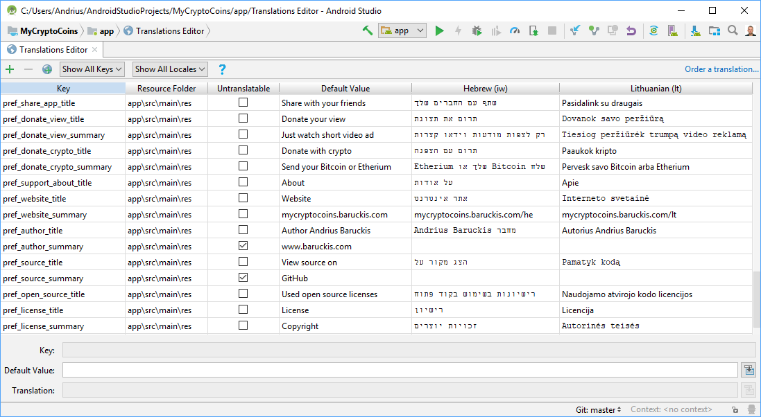
When I decided to create this app, I set myself a goal not only to create it with default English UI, but also translate it to my mother tongue language Lithuanian from the start of development. This intention lead me to learn about localization in Android. What I have found is that to add a support for multiple languages is very easy. As I mentioned before, first you just need to separate all your strings to strings.xml file and than you can launch Translations Editor tool inside Android Studio, which will allow you to add new languages support.
You will see that interface is self intuitive and now you just need to translate each string from your strings.xml file to new language. A new file will be generated by IDE in separate directory, for example for Lithuanian language values-lt/strings.xml. That’s it! 🙂 If you switch your Android device system language to the one you just translated and run your app, all the UI will be automatically updated to your translations. Moreover for My Crypto Coins app later I plan to add ability to switch languages at run-time. That’s why you will notice language switcher inside settings screen.

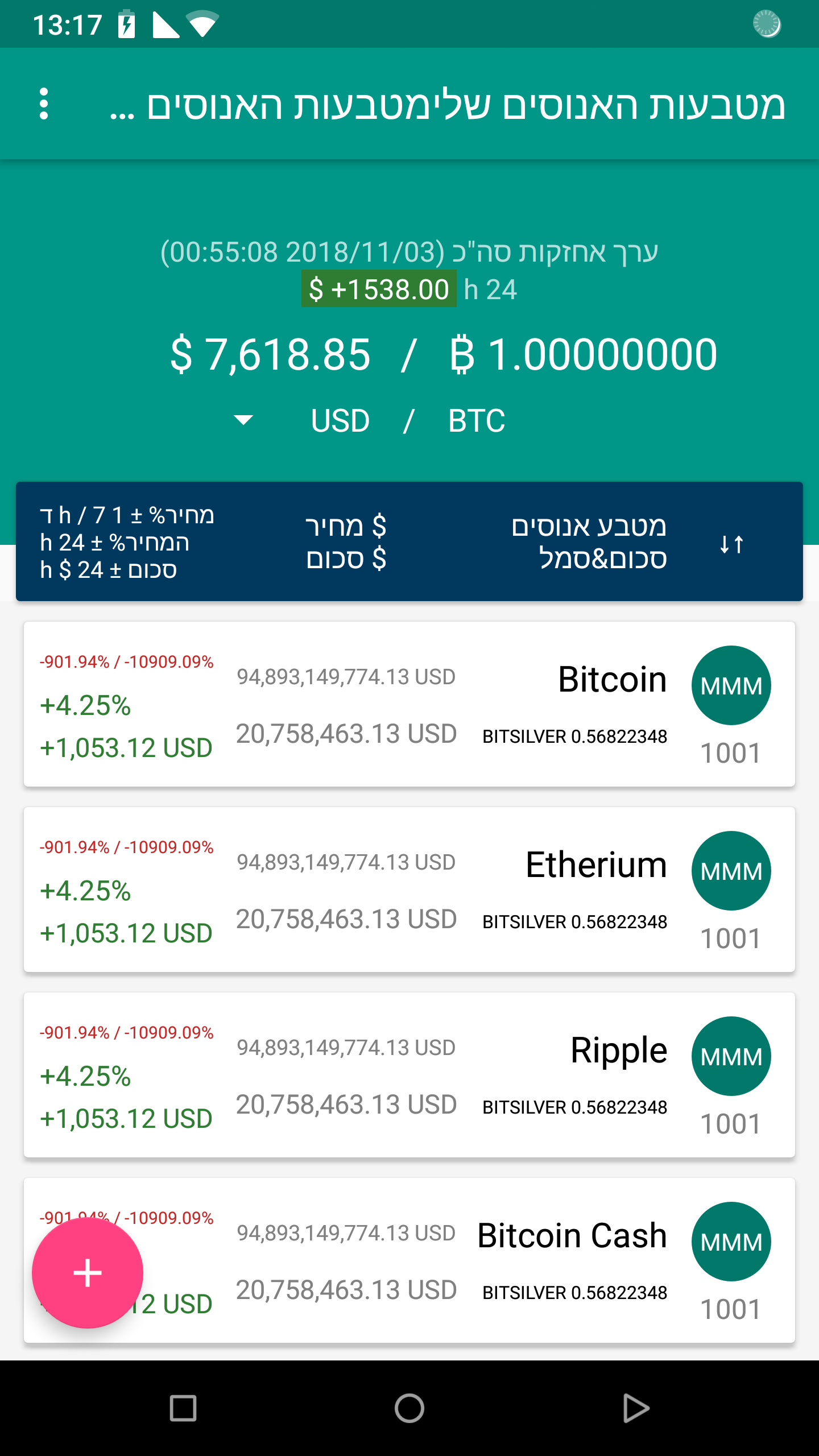
Translating your app to different languages will definitely widen your audience, but why not to go even more further by adding a support for a few special languages that are written from Right to Left (RTL) — like Arabic, Hebrew or Persian.

Actually to add RTL support is not difficult at all. Just add support attribute to your manifest file:
<manifest xmlns:android="http://schemas.android.com/apk/res/android"
    package="com.baruckis.mycryptocoins">

    <application
        android:allowBackup="true"
        android:icon="@mipmap/ic_launcher"
        android:label="@string/app_name"
        android:roundIcon="@mipmap/ic_launcher_round"
        android:supportsRtl="true"
        android:theme="@style/AppTheme">
        ...
    </application>

</manifest>
Congratulations, your app now supports RTL. However you can’t trust blindly that everything will work correctly straightaway, so you should check how well it is supported yourself. To do that select one of RTL languages as your primary device language or from Developer options in Settings, check Force RTL layout direction.
Few tips for RTL:
- In all your layouts you will need to replace all
LeftandRightlayout properties withStartandEndequivalent. For exampleandroid:paddingLeftshould be replaced withandroid:paddingStart. - If you don’t have special drawable for RTL, perhaps you would like to mirror your current ones with special
autoMirroredattribute.<vector xmlns:android="http://schemas.android.com/apk/res/android" android:width="24dp" android:height="24dp" android:autoMirrored="true" android:tint="@color/colorForPreferenceIcon" android:viewportHeight="24.0" android:viewportWidth="24.0"> <path android:fillColor="#FF000000" android:pathData="M1.5,4V5.5C1.5,9.65 3.71,13.28 7,15.3V20H22V18C22,15.34 16.67,14 14,14C14,14 13.83,14 13.75,14C9,14 5,10 5,5.5V4M14,4A4,4 0 0,0 10,8A4,4 0 0,0 14,12A4,4 0 0,0 18,8A4,4 0 0,0 14,4Z" /> </vector> - If there are special places where you need to have LTR instead of RTL, you can do it too. For example to force any layout to LTR just add
android:layoutDirection="ltr"to that view, or if you need to force text direction inside text view than useandroid:textDirection="ltr".
By the way when using Translations Editor you have a very useful feature to order a professional translation service. Even if I personally don’t know anything about Hebrew language, I still set myself a goal to add a support for it as an exemplary RTL language for My Crypto Coins project. So this feature seemed for me like really good idea to try. I ordered translation successfully from English to Hebrew directly from IDE with just a few clicks.
Final thoughts
In the second part all the UI layouts with some initial code were created based on detailed mockups. Here we covered a lot of various topics and I really hope I didn’t confused you. I did not wanted to go too much into details on each topic, my goal was to show you how to see a bigger picture, how to focus on small details first and avoid costly mistakes later. If you find something not covered well enough than I advice you to do your own research. There are always plenty of good resources over the web to learn from. 😉
Repository
You can find all new XML layouts and code created for this part 2:

This post was also republished on Medium. Show your support by clicking the clap button 👏 on the story page here. 😇🙏